
“Can you design it so both my mom and a degen would use it?” said my boss. It sounded like an impossible task. And yet, that single question became the guiding star of our entire redesign.
In our heads, we kept coming back to 2 very different archetypes.
On one side, there’s “Mom”.
Not literally my mom, but anyone entering crypto for the first time. She’s intimidated by the language, by concepts like seed phrases, private keys, gas fees, and by the idea that one wrong click could mean losing access to her money forever. For her, crypto feels fragile, irreversible, and unforgiving. The biggest fear is not understanding what’s happening or why it matters.
Then, there’s the “Degen”.
He wants the exact opposite experience:
- Full control;
- Maximum speed;
- Deep information;
- and most importantly – zero hand-holding!
He doesn’t want explanations he already knows, tutorials he’ll skip, or guidance that slows him down. He expects advanced features, complex settings, and instant access to everything, all in one place.
Designing a single product that can make both of them feel at home means constantly navigating between fear and confidence, between guidance and autonomy, between simplicity and depth.
And getting that mom-to-degen balance wrong means failing one of them completely, which we couldn’t risk while building Solflare.
Between Fear and Control, Especially In Web3
That’s where we, you and me, as Product Designers, come in. Think of us as translators, trying to create a product simple enough to enter, but deep enough to stay. Every decision lives on that thin line: simplify too much and you alienate power users; don’t simplify enough and you scare away newcomers.

This tension is especially brutal in crypto: In Web2, you can reset a password. In Web3, there is no reset button. Mistakes are permanent, and that changes the weight of every decision.
This is where Solflare’s philosophy of progressive complexity comes in.
By default, the experience should feel familiar and safe, grounded in mental models people already know from everyday apps and traditional finance. But the depth is always there, just one or two layers below the surface: Advanced controls, detailed information, and powerful tools exist for those who seek them, yet they’re never forced on users who aren’t ready.
Complexity isn’t removed. It’s revealed gradually, at the moment it becomes meaningful for the user, for the degen in this case.
Constant Tension Kept Creeping Up
The first real collision point we faced was the seed phrase, which is the most important concept in self-custody, introduced at the worst possible time:
- For Mom, it’s terrifying. A set of random words she’s told to write down because it’s the key to all her money, without yet understanding why or what could go wrong.
- For the Degen, it’s a given. Our principle here is simple: don’t dump the textbook at the door.
Instead of overwhelming people with cryptography and security theory upfront, we introduce concepts when they become relevant, providing context in human language.
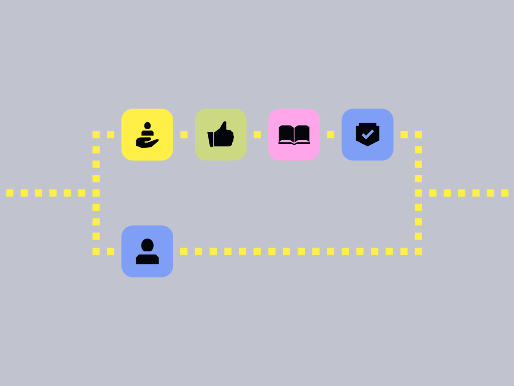
The second tension was guidance versus speed. New users need reassurance, confirmation, and clear steps. Experienced users need the opposite: no friction, no hand-holding, no delays. The compromise lies in optionality. Guidance is there when you need it, but it’s never a wall. It can be skipped, dismissed, and bypassed. One flow, two tempos.
Then came language. We never wanted to pretend crypto isn’t crypto. So instead of deleting terms like “seed phrase,” “gas,” or “slippage,” we chose to translate them. We kept the native Web3 language, but gave it a human accent through context, explanations, and real-world mental models. That made the abstract understandable without dumbing it down.
Emotionally, the whole process felt like designing under a constant spotlight. Every decision carried weight, because the crypto community does not forgive. You’re not just choosing layouts, you’re shaping moments where people could lose money or access, move too fast, or make decisions they can’t undo.
It truly felt like building for two different worlds, one for the mom and the other for the degen, all at once.
The Problem Couldn’t Be Solved With A Single Interface
The way out of that deadlock wasn’t to find a single perfect interface, but to stop pretending one should exist at all. Instead, we found a third way through customization and modularity.

If you can’t design a single home screen that fits everyone, let people shape it themselves. A first-time user can keep things calm and minimal. A degen can turn the same space into a cockpit, surfacing advanced features and building a layout that reflects how they actually use the wallet. While many products present information in fixed ways, giving users true control over what they see, how it’s organized, and how it looks is still rare.
Looking back, the biggest win was realizing that you can reduce fear without removing power.
And the biggest lesson was accepting that you’ll never design one perfect layout that fits everyone. No single home screen, hierarchy, or set of defaults can serve all use cases equally well.
That’s why customization isn’t a nice-to-have, but foundational. Clarity becomes a feature in itself. Trust isn’t something we can just claim on Solflare’s homepage. It’s something we needed to design, step by step, screen by screen, moment by moment.
Because mass adoption isn’t choosing between Mom and Degen. It’s designing for both.